
My Emergency Backup Power Webcast
Join me on March 30th at 7:00PM EDT for a new webcast series on emergency backup power for your home…

Everyone,
Many of you have been affected by home power outages in the last year. And if not directly, then you probably know someone who was. Here’s a graphic of the number of power outages by state in 2022 alone.
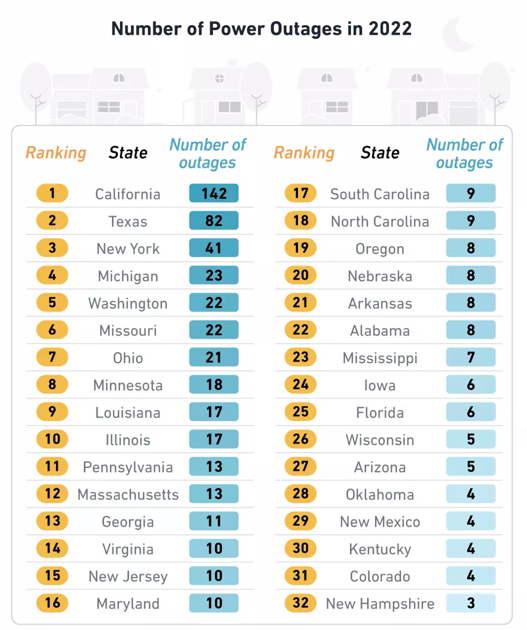
You can see that in just my tiny state of Maryland there were 10 outages during 2022, while California had 142 and Texas had 82 power outages. And many of these power failures affected up to a million households for a week or more.
Are these failures dangerous?
Yes, they certainly can be. Outages during the winter have resulted in people freezing to death, while in the heat of summer they can be dangerous for seniors and infants.

Plus millions of people need power for medical devices such as CPAP machines, Oxygen Generators and even Home Kidney Dialysis treatment.
Are there backup power solutions?
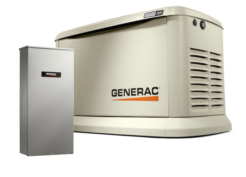
While there are lots of companies advertising solar panels, whole house generators, and PowerWall batteries, many of these backup systems can cost tens of thousands of dollars or even more. Not everyone has that kind of extra money for emergency backup power.
What am I doing about this?
I’ve teamed up with several companies that are interested in exploring affordable emergency backup power solutions for the pubic. Think of this like boondocking at home.
What do I know?
I’m the technology integrator in the middle of this group, so I’ll be testing everything to make sure it all operates together as envisioned.
And while I don’t know enough for definitive answers yet, I’m now experimenting and demonstrating technologies and techniques that can provide reliable home backup power starting at a few thousand dollars, with dual-fuel inverter generator solutions that can power your refrigerator, freezer, well pump, and central air conditioner or heat pump for a weeks that might cost less than $5,000.
We’re having a panel of experts
So join me for a live webcast this Thursday, March 30, beginning at 7:00pm Eastern Time. This will be a live panel discussion featuring several experts in topics such as generator transfer switches, as well as adding Soft Start technology to your existing central air/heat pumps. And as you well know, I have an extensive background in portable generators and power distribution.
We’ll add more experts each month for more webcasts on topics such as residential solar panels, battery backup for home power, and bi-directional charging for your EV car or truck. Plus I’m looking for experts on home medical devices.
How to participate….
It’s on YouTube Live, so no Facebook or Zoom account is needed to watch. Plus you’ll be able to text questions to the panel in real-time for us to consider and answer. Just click on the YouTube link below for an email reminder for the webcast starting at 7:00pm Eastern time on Thursday, March 30.
Sign up for an email reminder below…
Here’s your chance to discuss this important topic with a panel of experts. Just click the YouTube link below to sign up for an email reminder. And please share this post with everyone you know.
Let’s play (and stay) safe out there… Mike

Since the rankings seem to be the biggest states at the top, a more reasonable way to look at it might be outage days per 100,000 people. That would better show the pain people endured with long outages and weigh it for the number of people affected. Or maybe outage-people-days / 100,000 people which would give us units of outage-days.
Would you please share your source data that you used to create the graphic?